Sleeping in Color: How Chromotherapy Is Quietly Reshaping Bedroom Design
The most useful thing I ever heard a stager say — and I have heard a great many stagings discussed at great length in conference rooms and on front porches and over kitchen counters — was this: the bedroom is the room people buy with their nervous system. Not their eyes. Not their budget. Their nervous system.
She meant it practically: declutter, remove the personal, pull the blinds to control the light. But the longer I have sat with that observation, the more I think it reaches further than staging advice. The bedroom is the only room in a house we occupy with our bodies at complete rest. It is, of all the rooms, the one where the architecture and the palette and the materials are most likely to be doing something to us rather than simply for us.
A growing body of design thinking — and a smaller but serious body of scientific research — is taking that proposition at face value.
The Science, Carefully Stated
Chromotherapy — the therapeutic application of color to influence psychological and physiological states — has a long history that runs from the color-healing chambers of ancient Egypt and Greece through the early Victorian experiments of Edwin Babbitt and into a contemporary research conversation that is more careful, more rigorous, and more interesting than its popular-wellness reputation might suggest.
The serious contemporary version does not promise cures. It asks a more modest and more answerable question: do specific colors, in specific contexts, measurably affect human physiological and emotional states? The answer, increasingly, appears to be yes — within limits, with variation, and with a set of mechanisms that researchers are still working to specify.
A 2018 study from the University of Sussex found that exposure to certain colors can reduce stress levels and promote relaxation — a finding consistent with a body of work in environmental psychology linking bedroom color choice to sleep quality and mood regulation. A separate line of research, published in the Journal of Environmental Psychology, documented direct relationships between the chromatic character of sleeping environments and the quality of rest reported by subjects within them.
The practical design application is more nuanced than the wellness shorthand suggests. It is not that blue is always good and red is always bad. It is that different hues influence physiological arousal in ways that matter when you are trying to move from wakefulness into sleep — and that a bedroom designed without attention to this is, at minimum, leaving something on the table.
India Mahdavi and the Emotional Color Room
No designer working today has thought harder, or more rigorously, about the emotional life of color than India Mahdavi.
The Paris-based designer — born in Tehran to an Iranian father and Egyptian-English mother, raised across the U.S., Germany, and France, trained in architecture in Paris and New York — has built an entire practice around what she has called the emotional dimension of color. She worked as artistic director for Christian Liaigre before establishing her own studio in Paris in 1999. In the decades since, her client list has grown to include Valentino, Givenchy, Ladurée, and a roster of private residential commissions that span from Paris apartments to Hamptons beachfront houses.
Her most famous public project is the Sketch London restaurant — the Gallery room, with its deep blush walls and plush oval velvet seating in an interior that became one of the most photographed in Europe. But the Sketch palette, vivid as it is, is not Mahdavi’s most instructive work on color. Her residential interiors are more quietly telling.
In private commission after private commission, Mahdavi has demonstrated that a single correctly chosen color — terracotta, deep sage, a saturated indigo held in shade by the light conditions of a specific room — can shift the emotional register of a space in ways that furniture arrangement, artwork, and materials cannot replicate. She has spoken about color as a decision made from the inside out: you begin with how you want the occupant to feel when they wake, when they turn off the light, when they lie in that particular dark with the particular quality of silence the room makes.
Her furniture designs — particularly the Bishop stool, which comes in a range of colorways that function almost as palette samples — reflect the same thinking in object form. Each color is a proposition about mood.
What the Research Actually Says About Hue and Sleep
The relationship between bedroom color and sleep quality is more complex than the popular palette guides suggest.
Research is consistent on a few broad points. Warm colors — reds, saturated oranges, bright yellows — activate the sympathetic nervous system, the branch associated with alertness and arousal. This is useful in kitchens and studios. It is less useful in rooms where the goal is descent into sleep. Cool colors — blues in particular, but also soft greens and some grays — are associated with reduced physiological arousal and promote the slower breathing and lowered heart rate that precede sleep.
One widely cited survey found that people with predominantly blue bedrooms reported sleeping an average of seven hours and fifty-two minutes per night — the highest of any color group surveyed. The mechanism is not purely psychological: blue wavelengths interact with the circadian system in ways that researchers are still mapping. There is a complication: the same blue wavelengths that promote daytime calm can interfere with melatonin suppression in high-intensity artificial light conditions. The blue wall is a different object in daylight than it is under a bright LED fixture at ten at night.
This is why the most thoughtful chromotherapy-informed bedroom design treats color and light together, not separately. The palette is one variable; the light source, its color temperature, and its intensity at different hours of the day are others. A deep indigo bedroom lit with warm, low-intensity bulbs in the evening is doing something categorically different from the same bedroom lit with cool overhead fluorescents.
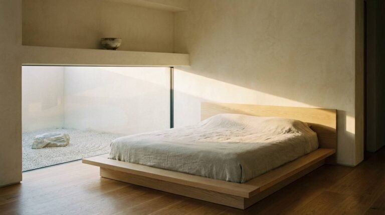
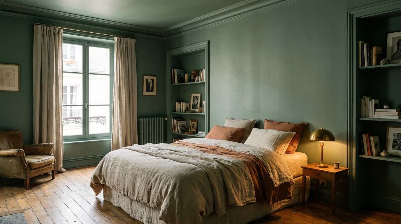
Warm sage — the dusty, slightly gray-green that has appeared across Farrow & Ball’s bedroom color guidance and in countless high-end residential projects over the past several years — occupies a particularly useful position. It reads as green (associatively calm, biologically neutral in terms of melatonin interaction) while carrying enough warmth in its undertone to prevent the cold-room effect that purely cool palettes can produce in low light. It is one of the better-performing colors for bedrooms that need to work across multiple lighting conditions and seasonal light changes.
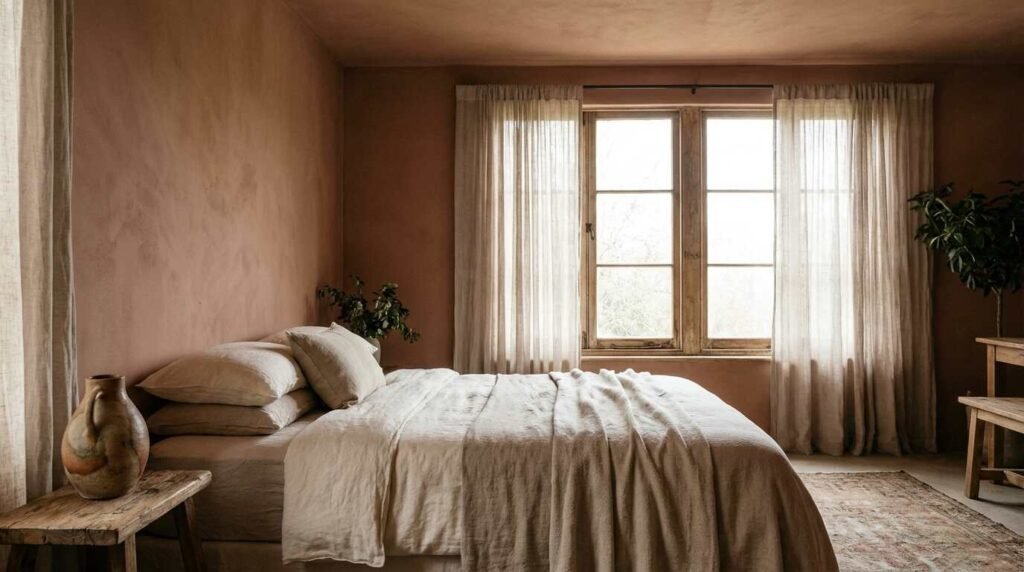
Terracotta, a warmer choice, works differently and requires more care. In north-facing rooms with limited direct light, a deep terracotta can read as a warm cocoon — the room wraps itself around the occupant in a way that blue cannot. In south-facing rooms with strong afternoon light, the same terracotta can tip into agitation. The color is not separable from the light it lives in.
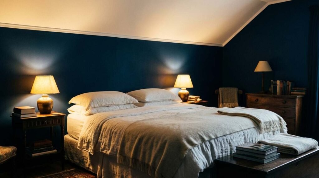
Deep indigo — handled with restraint and paired with warm light sources — is among the more powerful choices for a bedroom where the goal is not just sleep but a particular quality of enclosure, the sense of a room that has gathered itself around you.
Farrow & Ball and the Practical Application
Farrow & Ball occupies a useful position in this conversation because its color guidance is among the most sophisticated in the consumer market — and because its palettes for bedroom spaces reflect a genuine engagement with the relationship between hue, light, and mood rather than simple trend-following.
Their bedroom guidance distinguishes between neutrals, aquatic shades, and botanical greens as particularly suited to sleep — a distinction that maps reasonably well onto the research on physiological arousal and color temperature. Their deeper palette choices — Paean Black, Railings, Plummett — appear in the context of bedrooms designed for enclosure and intimacy rather than airiness, reflecting the research finding that dark, enveloping rooms can be as restorative as pale ones, provided the light conditions support them.
The more interesting design move is not the obvious one (paint the bedroom blue, sleep better). It is the layered approach: choosing a wall color, then building the soft furnishings, light sources, and window treatment in deliberate relationship to it. The chromotherapy-informed bedroom is not a room with a color. It is a room that is a color — where every surface decision is made in service of the same physiological goal.
The North Shore Application
On the North Shore, where a significant portion of the housing stock is pre-war — Colonials, Capes, Craftsmans, Dutch-style farmhouses — bedrooms tend to have real architectural character: plaster walls, moldings, double-hung windows with divided lights that fractalize the incoming light in ways that newer construction doesn’t. These rooms are already doing something with light. The question of color in them is not decorative but responsive: what palette allows the room to do what it is already trying to do?
North-facing bedrooms on the North Shore — especially in the older tree-heavy neighborhoods like Matinecock, Setauket, and Cold Spring Harbor — receive a cool, indirect light that reads as soft blue-gray through much of the day. A cool-palette color in these rooms can tip from calm to cold. Warm sage, soft terracotta, a barely-there ochre: these work with the existing light character rather than against it.
South-facing rooms with Long Island Sound light — particularly the bedrooms in waterfront houses where summer light stays bright until eight in the evening — require more careful chromatic management. The indigo that works beautifully in a shaded bedroom can feel oppressive when the sun comes around in the afternoon. These rooms respond well to deeper greens or to warm neutrals that anchor without fighting the light.
When I work with buyers on renovation planning, color is almost never the first conversation we have. It should probably come sooner. A bedroom that helps you sleep well is not a luxury. It is the foundation of everything else.
You Might Also Like
- The Return of Aged Brass: Why Designers Are Ditching Chrome for Something Warmer
- Salt, Spray, and Staging: Beating Coastal Wear and Tear Before You List
- North Shore Bluff Homes and the Erosion Question: What Buyers Need to Know
The stager was right: the bedroom is the room people buy with their nervous system. But the nervous system is responsive to the room long before the first showing. The people who live in a well-designed bedroom sleep better, feel better, and — when the time comes — describe their house to potential buyers with a particularity and warmth that no amount of staging can manufacture.
Start with the paint chip. The rest will follow.
Real estate markets change. For current listings and market data, contact Pawli at Maison Pawli.
Sources
- University of Sussex, 2018 — Color exposure, stress reduction, and relaxation research (verify primary publication before formal citation)
- Journal of Environmental Psychology — Bedroom color and sleep quality (verify specific issue before formal citation)
- India Mahdavi Studio — Designer biography and practice: indiamahdavi.com
- Farrow & Ball — Bedroom color guidance and palette documentation: farrow-ball.com/room-inspiration/bedroom-ideas
- Connections by FINSA — Chromotherapy, circadian rhythm, and light interaction: connectionsbyfinsa.com
- MDPI Buildings journal — Color palette, circadian rhythm, and melanopic lux in bedroom simulations (2023): mdpi.com